Britto & Co.
Role:
Brand Identity
Timeline:
4 Months
Overview
The project was to create a brand identity that reflected prestige, collaboration, and modern elegance. The visual direction needed to balance professionalism with creativity, ensuring the brand would stand out across architecture, fashion, and management.
Process
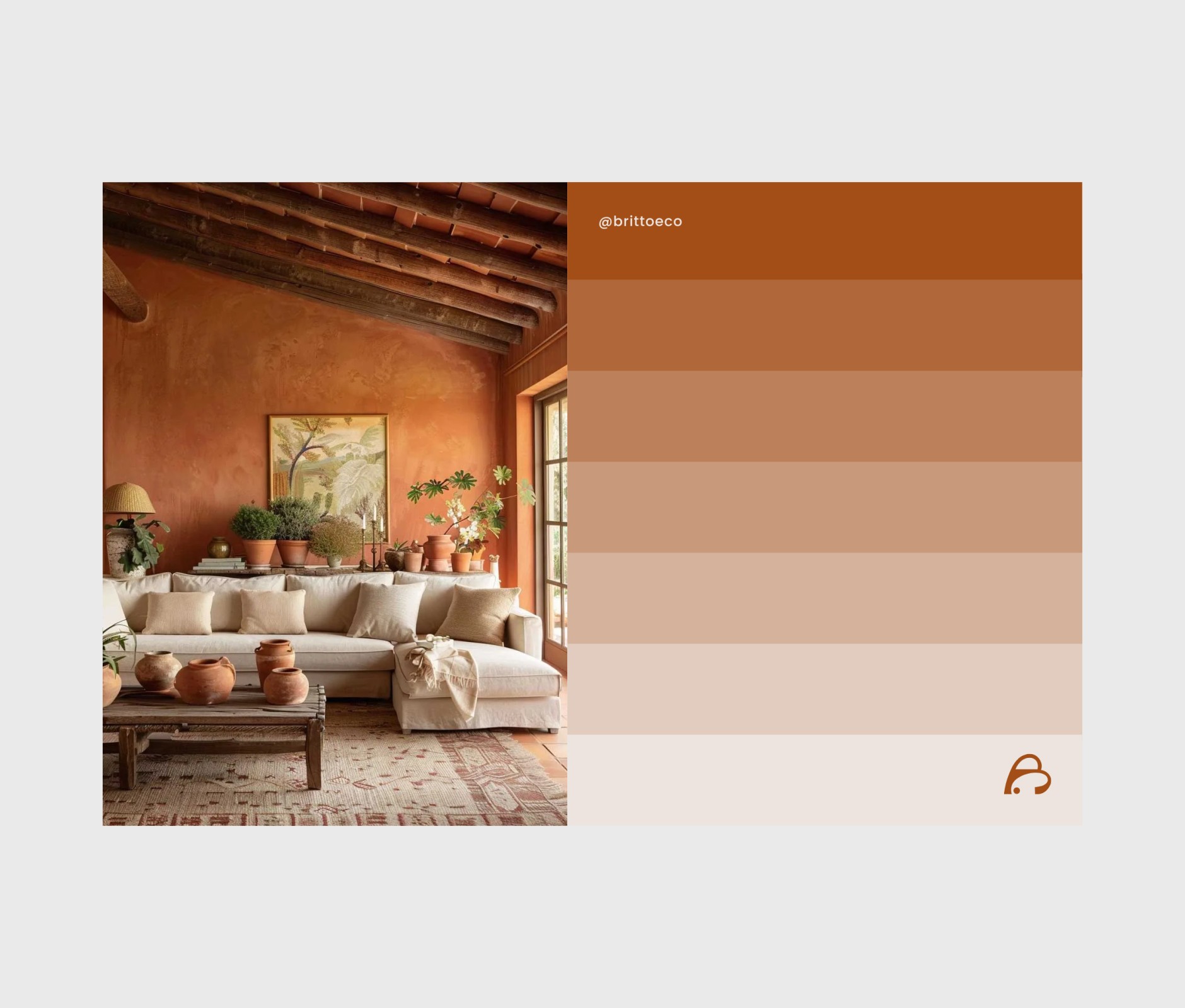
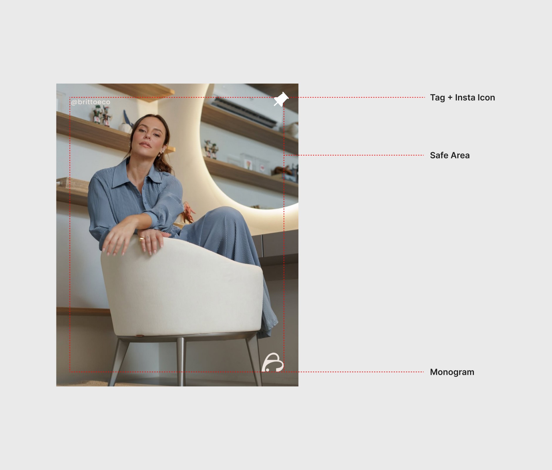
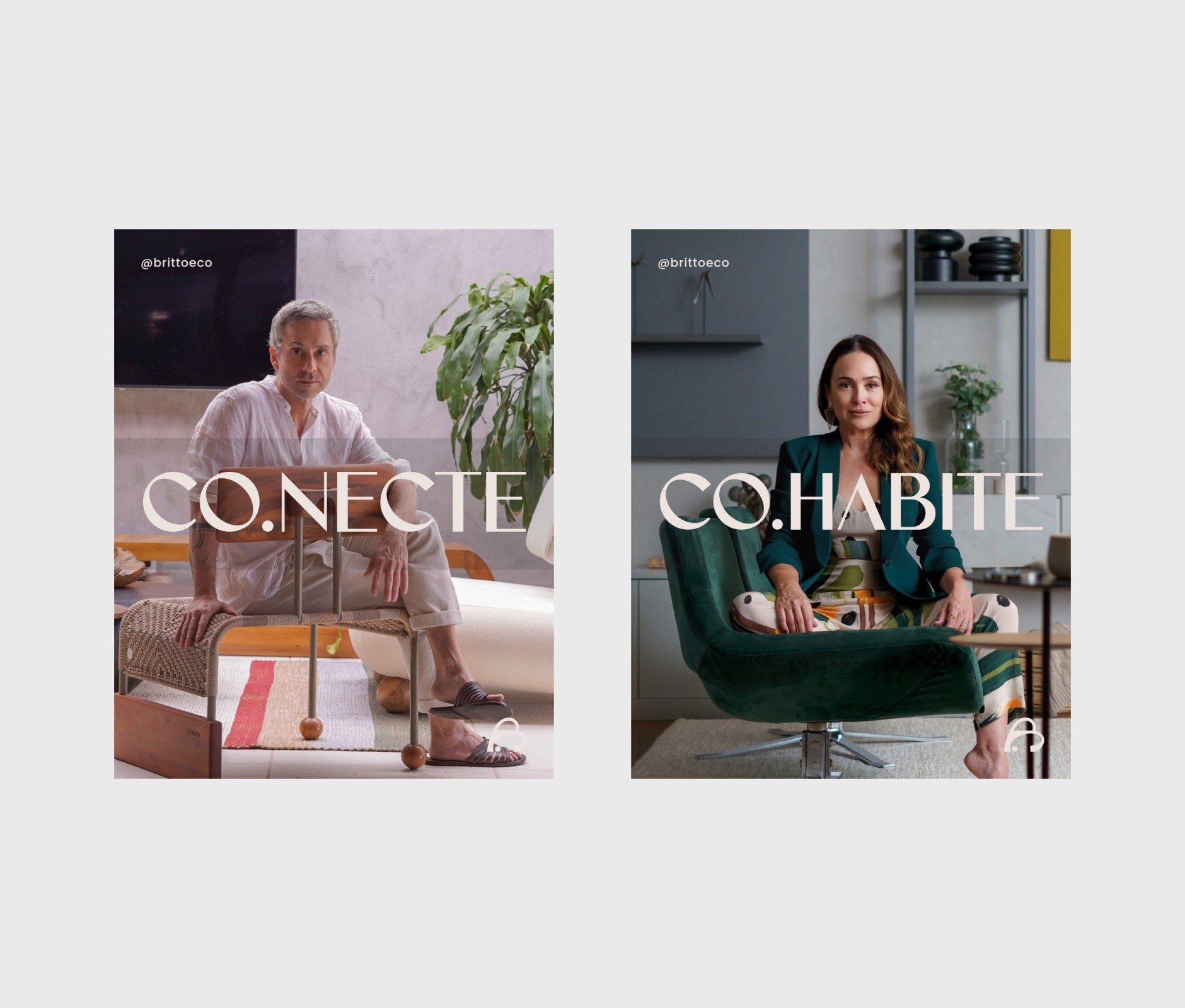
The process included auditing the existing product, refining the brand development strategy, and creating tailored presentations aimed at high-end clients. Work also extended to designing engaging social media content and developing a strong visual identity centered on a distinctive monogram, a cohesive colour system, and carefully selected typography. A key challenge was developing a brand system flexible enough to represent multiple industries while maintaining cohesion. This was resolved through a minimalist design language, refined typography, and a versatile colour palette, enabling adaptability without compromising a premium and consistent identity.
Results
The rebrand established Britto & Co. as a forward-thinking collective with a visual identity that balances elegance and adaptability. Beyond aesthetics, the system improved how the brand communicates with diverse audiences, creating clarity in its message and a stronger emotional connection with clients. Presentations gained a polished and persuasive quality, social channels reflected consistency and sophistication, and the visual identity reinforced trust through a distinctive monogram and coherent design language.


Next 👉
